Store Health Dashboard for a Global Sports Retailer
Shipped dashboards for 100+ stores in India and designed a global benchmarking tool.

Name of client blurred out due to NDA restrictions
Project Details
Company: Promantia Business Solutions | Team: Client, 2 Project Managers, 3 Developers
Role: Sole UX Designer (End-to-end Leadership) | Timeline: Dec 2023 (4 weeks)
Tools: Figma, Client's ERP System
The Challenge
This sporting goods retailer wanted an easier & more insightful way to track maintenance incidents across 100+ stores.
This retailer's zonal managers are responsible for monitoring the health and maintenance of over 100 retail stores. While the organization collected a large volume of data, it lived across five separate reports, each with its own structure, terminology, and interface on the company's internal ERP.
Managers were forced to:
Toggle between multiple dashboards
Manually cross-reference KPIs to calculate a store's health
Interpret raw data under time pressure
As a result, identifying which stores required attention was slow, error-prone, and mentally exhausting.
The core issue wasn’t lack of data but rather a lack of clarity. Therefore, the problem the team set out to solve was the following.
How might we transform scattered operational data into a single source of truth allowing zonal managers to quickly identify risk and make informed decisions at scale?
The Value I Delivered
I designed & deployed a centralized dashboard that transformed data overload into actionable clarity.
Consolidated 4 disconnected reports into one unified KPI dashboard used across India
For the system

Enabled faster operational decisions and reduced reliance on manual data interpretation
For the business

80% faster store performance reviews with instant visibility into high-risk stores
For the users

The Solution
Search stores or groups of stores across the country to gauge store “health” for those regions.
View the overall health of store and hover over charts to learn more.
Click on cards to get an expanded view with further details.
Overall Outcome:
• Deployed across 100+ stores
• 80% reduction in review time
• Unified data visualization for operational decisions
The Deep Dive
Here’s how I hatched the solution
Framing the Challenge
Managers manually reviewed 5 separate reports (10+ metrics each) to determine store risk, a slow and inefficient process.
I began by exploring the company's internal ERP tool, uncovering five separate pages and dozens of disconnected metrics. I mapped the relationships between these reports to identify the core KPIs that truly determined store "health."

Blurred due to NDA restrictions
I led meetings with project managers and developers to define the technical constraints of the project. I advocated for an "Aggregated Score" model, ensuring that our visual solution was grounded in the data reality of the engineering team.
Understanding the Users
“We just want to see which stores need attention fast.”
During a site visit to the company's head office in India, I had the chance to observe zonal managers in their natural environment. Observing them manually cross-reference reports and toggling between screens made me understand their pain points.
•During client conversations, one phrase kept coming up:
“We just want to see which stores need attention, fast.”
That line reframed the problem from “visualizing all data” to “surfacing what needs action.” This shift inspired the dashboard’s focus on prioritized summaries with expandable detail layers.
Ideation & Gauge Evaluation
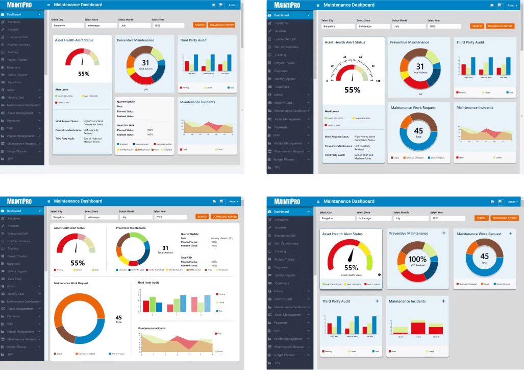
Considering best data visualization practices and stakeholder feedback, I settled on the Gauge Meter as the main visual to assess store health.
I explored multiple ways to visualize "Health" and the component metrics. Weighing pros and cons, looking at "chart junk" and basically how easily it reads to the user, I iterated on various kinds of visualizations seeking feedback from the team (developers and project manager) and the client to ensure it aligned with their vision.

While a line graph seemed suitable, users found it difficult to interpret at a glance. Instead, they preferred stacked bar charts, which provided a clearer and more accessible overview of the three categories.
I explored multiple ways to visualize "Health." Through 5 iterations, I settled on the Gauge Meter concept, testing it with stakeholders to ensure it was the most intuitive focal point for the dashboard.
Wireframe to Hi-Fi Transition
To focus on faster interpretation, I led the design of Hi-Fi prototypes of the dashboard with expandable cards containing details.
To ensure consistency, I crafted a library of reusable components which included buttons, charts, and status indicators. This also aligned with the company's brand while remaining easy for developers to implement quickly.

Once all the stakeholders agreed to the visualizations, I led the translation of our KPI mapping into interactive prototypes. I focused on a Progressive Disclosure model, keeping the main dashboard clean while allowing for "one-click" deep dives into metadata.
Because design and engineering ran in parallel, I facilitated weekly stand-ups to negotiate feature feasibility. This ensured that our 4-week timeline was met without sacrificing the integrity of the user experience.
After final feedback loops with client managers, the dashboard was validated and officially deployed across 100+ stores. The final result wasn't just a new UI—it was a new, 80% faster workflow for the entire organization.
You can interact with the prototype below.
Reflection
The main challenge for me was the tight deadline, we had just two weeks to deliver the initial designs, which limited my ability to conduct thorough usability testing. I would have loved to gain insights from actual end users of the app rather than relying solely on feedback from managerial stakeholders (although to some extent, our client in contact was potentially a user themselves).
This project was my first major client engagement, and I found it eye-opening to see how thorough background research can directly inform and improve design decisions. It was also the first time I collaborated closely with developers, balancing technical feasibility with design goals to determine what we could realistically deliver to the client. Finding that balance was a valuable learning experience for me.
Check out my other work below: