Transit Mobile Application for Atlanta's MARTA
Led UX design and research for a transit platform serving a network with ~5.9 million boarding/month with features NOW LIVE on latest Breeze Mobile App.

Project Details
Company: Metropolitan Atlanta Rapid Transit Authority | Team: 2 UX Researchers + 2 UX Designers
Role: UX Design Lead and Researcher | Timeline: Aug 2024 - Dec 2024
Tools: Figma, Qualtrics
The Problem
Atlanta is preparing for the world’s biggest stage, but its transit experience is currently a puzzle with multiple apps.
In 2026, Atlanta will host 8 matches and 1 semi-final during the FIFA World Cup, welcoming an estimated 3.5M+ visitors, many navigating the city and its transit system for the first time. The stakes are high.
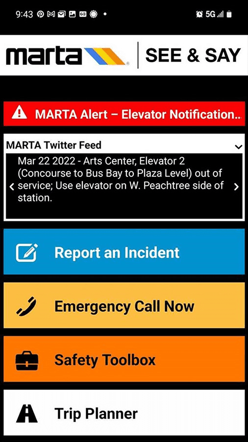
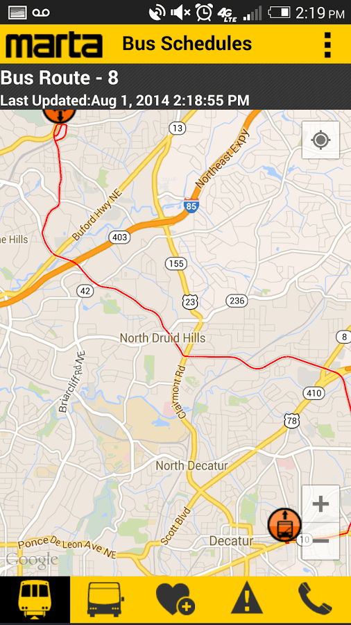


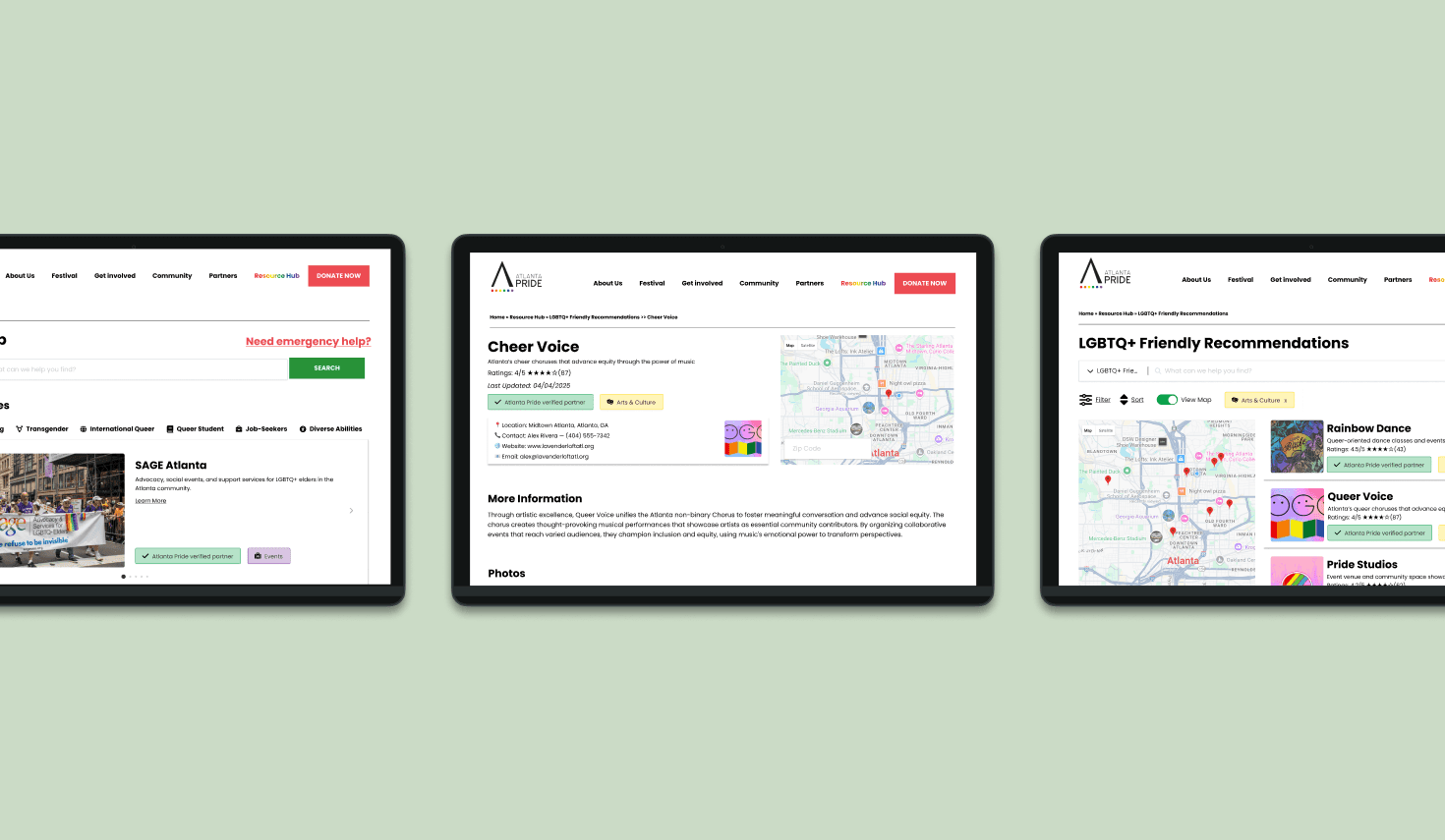
But, MARTA's digital experience is currently split across 3 disconnected tools, serving 3 different purposes.
One for ticketing.
One for navigation.
One for safety.
But as history has shown users need one single source of information for easier navigation.
Therefore, the team set out on a journey to solve the following problem statement:
How might we develop an all-encompassing platform to incentivize and encourage MARTA use during the 2026 FIFA World Cup?
Rather than redesigning trains or infrastructure, we focused on the real bottleneck: information overload during high-stress moments.
The Value I Delivered
I led the design of a unified platform that bridges the gap between MARTA’s infrastructure and a traveler’s actual needs.
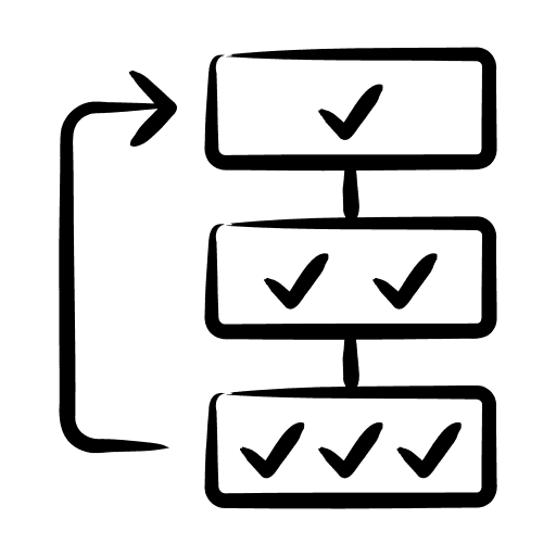
For the system
3 apps → 1 unified platform → 89% heuristic score
For MARTA

Built for 3.5M+ visitors, positioning MARTA as default transit choice
For the users

Group-first, goal-driven navigation → 83% successful group travel
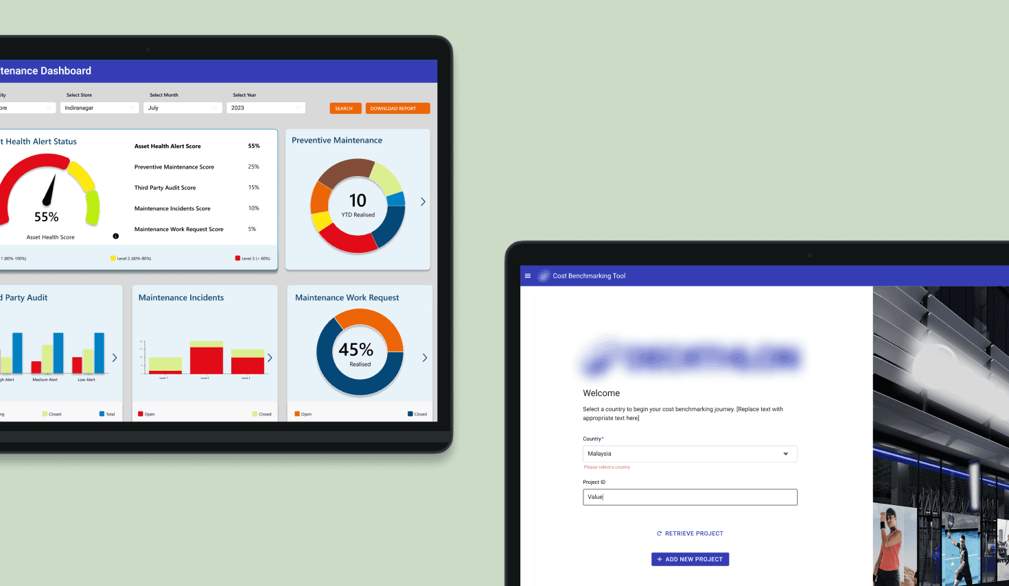
The Solution
The app streamlines the journey of a traveler, focusing on intuitive and task-based navigation
The Deep Dive
Here’s how I hatched the solution
Framing the Challenge
Riders get frustrated with public transit due to scattered and overloaded information.
Analyzing the 1996 Atlanta Olympics situation and aligning with MARTA stakeholders, we identified information overload through a multitude of scattered sources as one of the biggest drawbacks the system faced.
This, is still an issue right now.
Therefore, this framing shifted our focus from adding features to reducing cognitive burden at moments of uncertainty, which directly shaped the direction of the final solution.
We now had enough context to set our research questions as outlined below to answer to help us design our solution.
Research Questions
What features of transit planning and support systems do users prioritize when using public transportation?
How do users make decisions about whether to ride public transportation for events or choose alternative transportation methods?

What are the barriers people face when planning and riding public transportation?
What is the user perception of MARTA?
What problems do users face during times of high traffic on MARTA?
+
Learn more about how I framed the challenge
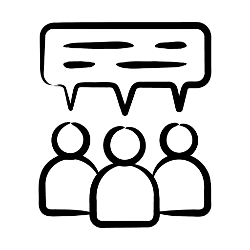
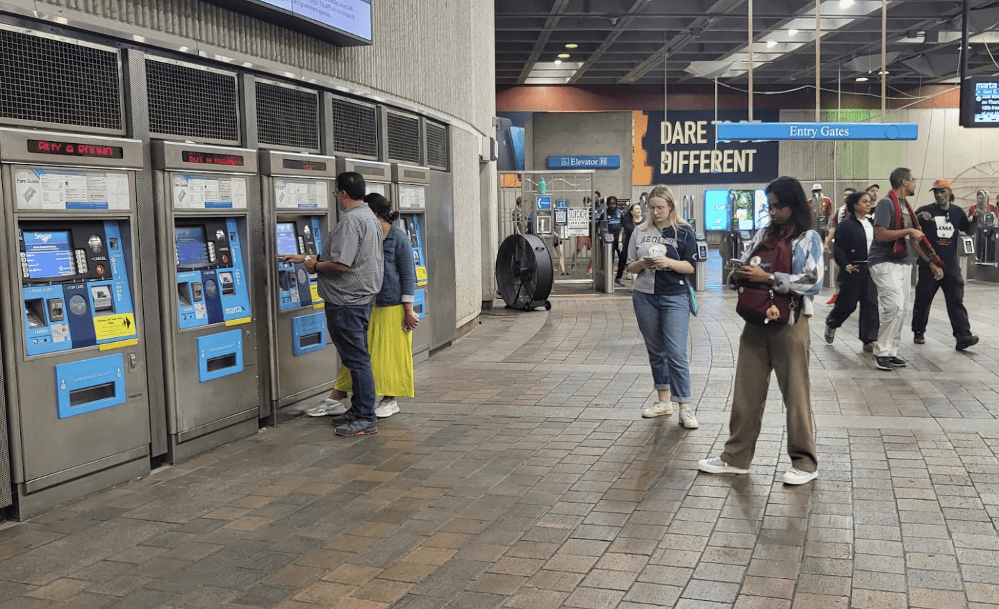
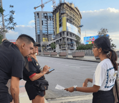
User Research
Besides intuitive navigation, ticketing and group travel revealed to be major pain points.
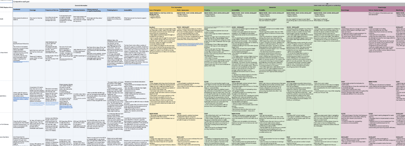
Once our research goals were clear, I helped lead a mixed-methods research effort (leading the development of the surveys and its analysis as well as identifying the competitors to do a comparative analysis) to understand how visitors want to envision their experience transit during major events.
Starting with a large-scale surveys and moving into interviews and fieldwork allowed the team to progressively narrow from behavior patterns to emotional drivers.
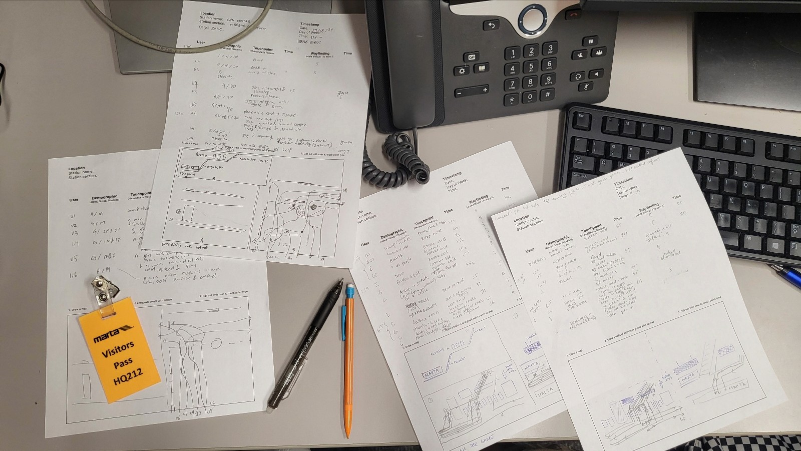
Surveys
Ethnographic Observations
Video Observations
Comparative Analysis
User Interviews


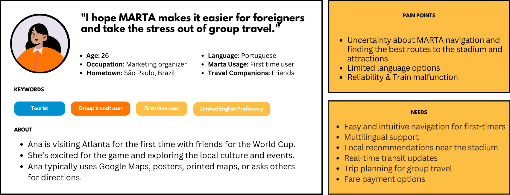
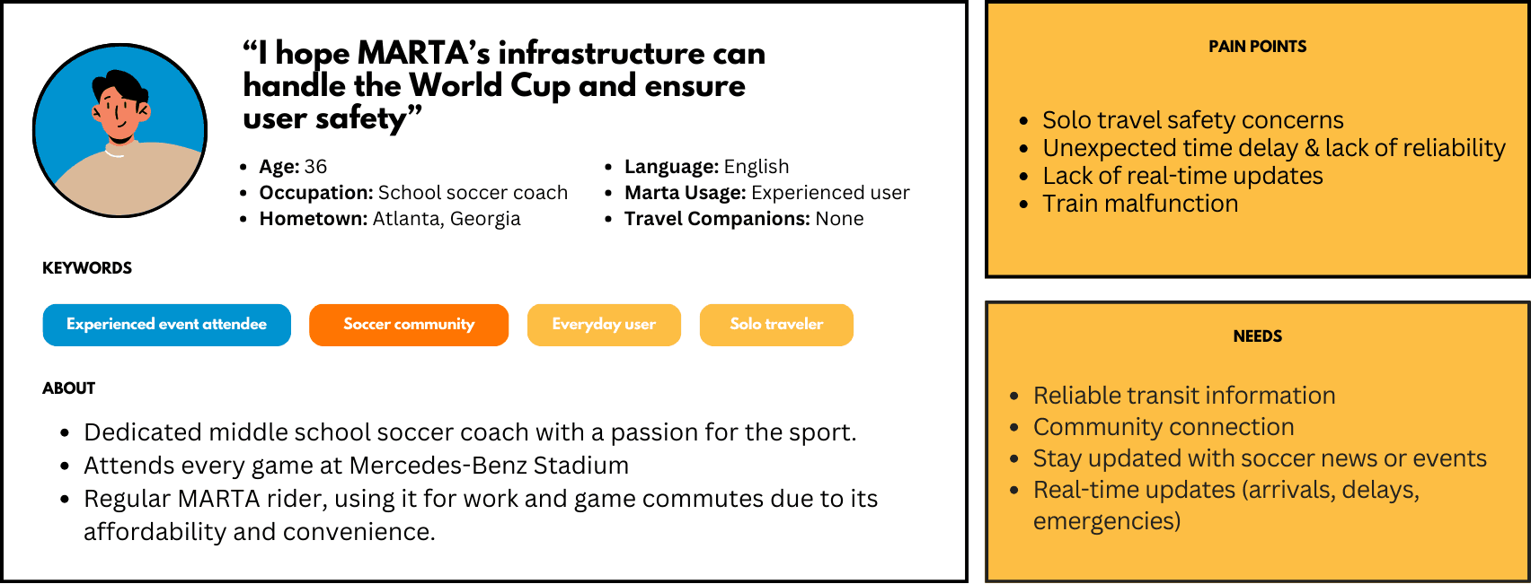
This sequencing revealed that most users weren’t just optimizing for speed. In fact, they were seeking reassurance through information, especially when traveling in groups or navigating unfamiliar terminology.
Additionally, ticketing was a major barrier in the user's journey. Therefore, we set out on the journey to design solutions for these answers to our research questions we found.

+
Learn more about my user-centered problem-solving
Designing the Solution
While the focus was on designing for users, decisions were made based on MARTA's considerations and business goals.
Brainstorming using Crazy-8s, we sought feedback from MARTA enthusiasts (yes, MARTA's own fanclub), the accessibility community and the MARTA committee at the headquarters themselves. Learning about their constraints, current projects and future vision allowed us to narrow our concepts into mere ideas ready for test, some of which in fact included consolidating their suite of applications into one!
One of our concepts was an AR feature, which MARTA mentioned is something in the works for them and that it can be very complex to implement in the moment.
I played a key role in translating user needs and MARTA's business constraints as the lead UX designer for the project. For instance, reassurance was manifested in terms of clear & informative navigation, train schedules and even safety features.


Seeing as to how stressful group travel and ticketing were, I introduced group ticketing features where a user such as can have a dependent.

Translating these concepts into actual wireframes, we sought feedback in terms of both usability testing as well as heuristic evaluations with actual potential users (especially, those who were most likely to attend the FIFA World Cup in Atlanta).
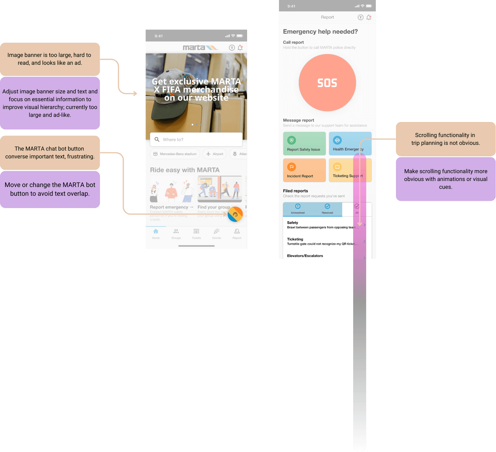
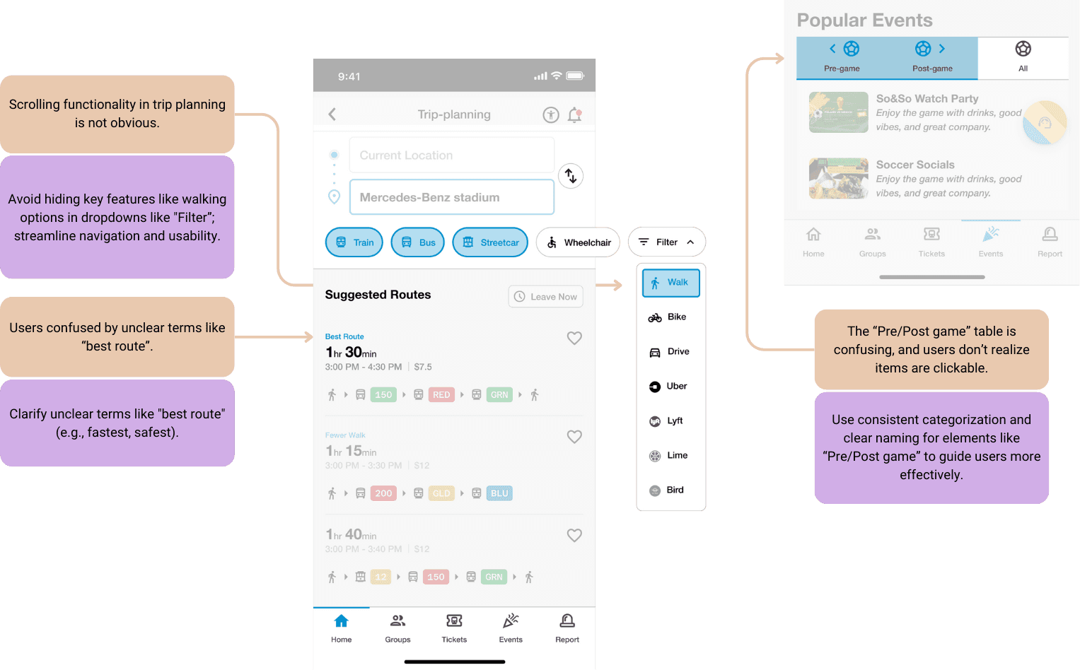
Most of their confusion lied in the fact that MARTA jargon (such as Northbound and Southbound) was new to them and that navigation could be made simpler and more upfront.
And finally, the culmination of our journey so far led us into designing the high-fidelity wireframes. I was also responsible for setting up the design system where we chose to use MARTA's iconic Pantone Process Blue to offer users a sense of warmth, safety and trust while at the same time retaining MARTA's branding
+
Learn more about how I designed the solution
Final Prototype
After the final rounds of iterations, I worked on designing the final prototype that you can interact with below.
Reflection
Focus on solving few problems well first rather than solving everything at once.
I learnt a great deal through this project, especially just how deep user research can reveal many interesting aspects like the group travel problem!
But the most important thing that I learnt was how we need to constrain ourselves and not get carried away by trying to solve everything. At some point, we were trying to tackle a variety of pain points and while they were important we needed to keep business needs of MARTA as well as our resource constraints in mind.
Check out my other work below: