Pick Harbor, a Warehouse Picking Management System
Led the product design process of a warehouse picking mobile application for clients using ERPNext as a database for the warehouse.

PROJECT DETAILS
Company
Promantia Business Solutions
Timeline
Aug 2024 - Dec 2024
Tool
Figma
Role
Sole UX Designer
Team
Project Manager, UI Developers
THE PROBLEM
During the parts picking process in a warehouse, order pickers typically use barcode scanners.
However, this is disconnected from the database used to track inventory. This would then require added manual intervention, raising time and efforts.
As our company diversified, we aimed to conceptualize and develop our own product using ERPNext which was one of the specialized services we provided.
Currently, our clients store all of their warehouse data on ERPNext, but the item picking process (which is the process of picking items from a warehouse to pack and ship to customers) is external and not connected to the ERPNext module, causing a need for manual entry and added updation of inventory. This was an EXTRA step that took a lot of time and effort.
Additionally, most of our clients used barcode scanners with a lack of a visual form of validation.
To address this, we planned to integrate the picking process with ERPNext and create a streamlined product in the form of a mobile app that simplifies the picking process integration as well as provides visual cues.
How might we integrate the warehouse picking process with ERPNext, reducing errors and time?
THE VALUE I DELIVERED
I led the design & development of our AI tool, Naiad, that lowered cognitive load for students using Slides.
For the system
Inventory updating now syncs with ERPNext database
For Promantia
Diversifying service and product offering to clients
For the users
Less error-prone flow with visual validation & sync
THE SOLUTION
The app allows pickers to scan barcodes, provides validation through visual cues and automatically syncs inventory to database.
Home Page and Pick Lists:
Browse through pick lists from various customers that are new or in progress or Revisit completed pick lists
Scan Items from Pick List:
Choose pick list to work on
Click the Scan Button to begin the scanning process
Scan location code first to confirm, continue to scan items
Item Details Page:
Click on each item to view its details
View details of the item
THE DEEP DIVE
Here’s how I hatched the solution
FRAMING THE CHALLENGE
Warehouse pickers should easily understand and be able to pick the right items for orders
I collaborated with the managerial team to understand the item picking process and created a user flow. To inform my design further, I also examined existing warehouse picking apps to analyze their user flows as well.
Interestingly enough, they had developed a similar flow, which validated my understanding.
Proposed User Flow
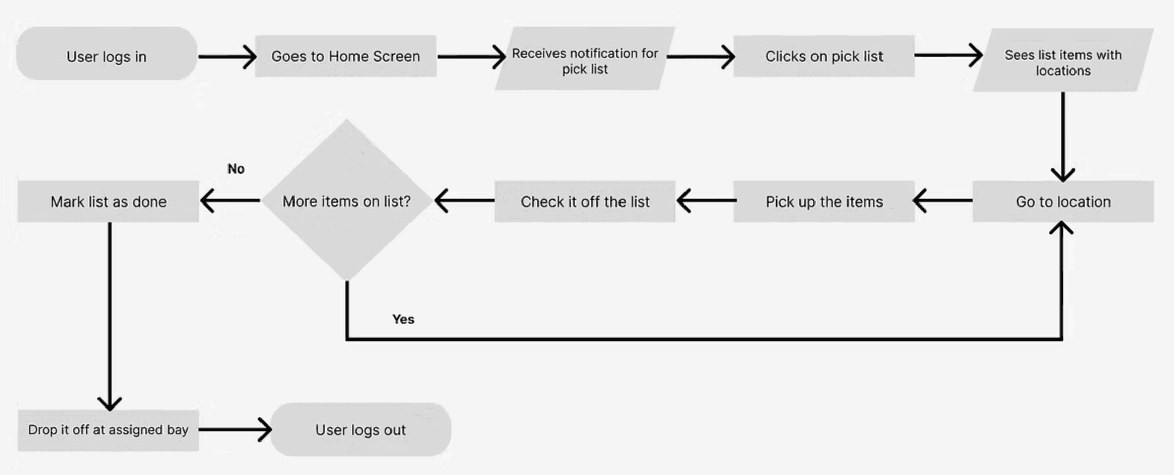
Additionally, after multiple discussions, the team realized that pickers would have to verify the location before scanning the items. Therefore, the scanning process would occur twice.
LO-FI WIREFRAMES AND REVIEW SESSIONS
Since this was the MVP stage, we prioritized designing the picking process experience first.
Once the user flow was established, I began brainstorming various feature ideas.
My background in Industrial Engineering tried to go back into thinking of how the users and the warehouse teams always aiming to optimize workflows on the shop floor. In order to do this, some basic metrics would help them create more efficient flows and therefore, I proposed the "key metrics" section.
Additionally, to assist with wayfinding for the pickers themselves, I also proposed an interactive map.
Low Fidelity Wireframes


However, after multiple discussions with the product team, we decided that the interactive map feature can be introduced at a later stage. This is because integrating an interactive map would be challenging due to the need for comprehensive knowledge of each industry layout and key touchpoints.
NOPE!

Therefore, we decided to focus on building an MVP version first and customizing it later to better serve each client. Consequently, I shifted my focus to more feasible features that could enhance the user experience without this complexity.
BUILDING THE DESIGN SYSTEM AND HI-FI WIREFRAMES
Keeping an "industrial" feel, I designed the branding, design system and iterated on the Hi-Fi wireframes 5 times.
In order to give an industrial-esque feel while keeping the branding of our company's logo, the primary color was chosen to be Jackson Purple.
Seeing as to how stressful group travel and ticketing were, I introduced group ticketing features where a user such as can have a dependent.
Design System

I also prioritized visuals and iconography over text-heavy interfaces because the pickers might not necessarily speak English. Supporting added language would be an added feature.
This would allow the pickers to rely less on text and making the interface more intuitive, rather than depending solely on language accessibility settings.
FINAL PROTOTYPE
Finally, the MVP is shown below with the development currently in progress.
REFLECTION
You can be creative and it's great! But also think of business constraints but don't limit yourself.
This project taught me a lot about how companies tend to prioritize features when it comes to developing their own projects. Especially thinking through the technical complexities that might come across by just the introduction of a simple feature.
It also taught me how to design with accessibility in mind, focusing on visuals and iconography. In the future, I would also like it to incorporate audio features to expand user bases.
Check out my other work below: